Retail design of a fast food restaurant in Aix
- Location : Aix-en-Provence
- Surface : 25 m²
- Objective : Create a retail space with a strong graphic identity
Une identité couleur affirmée
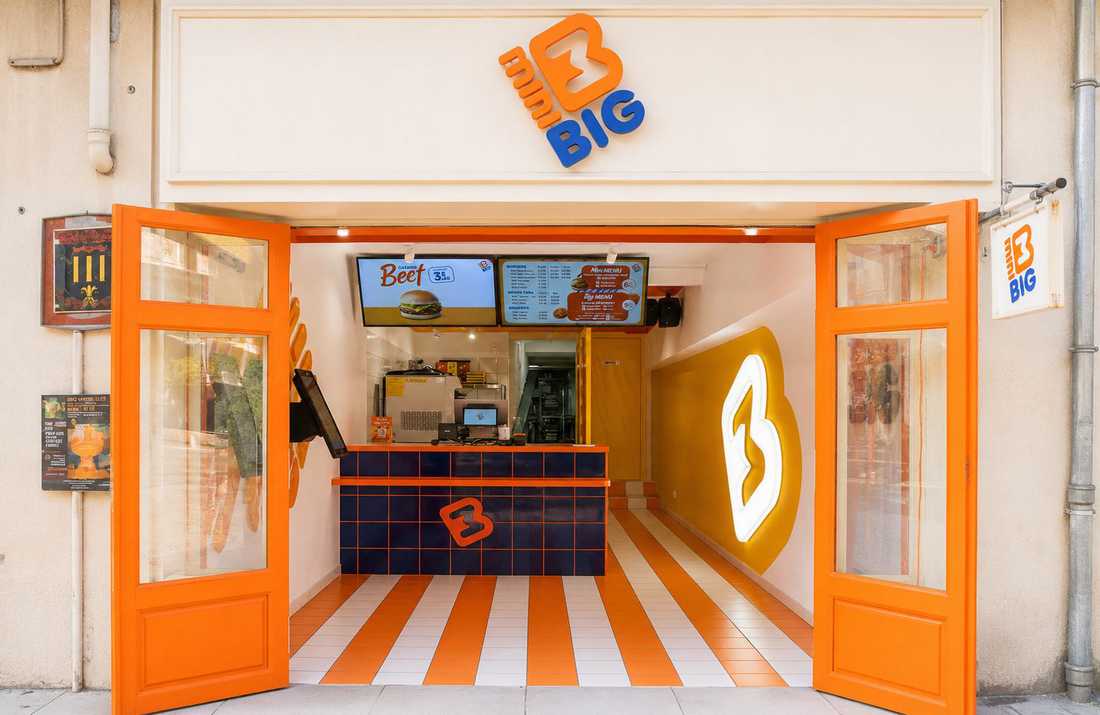
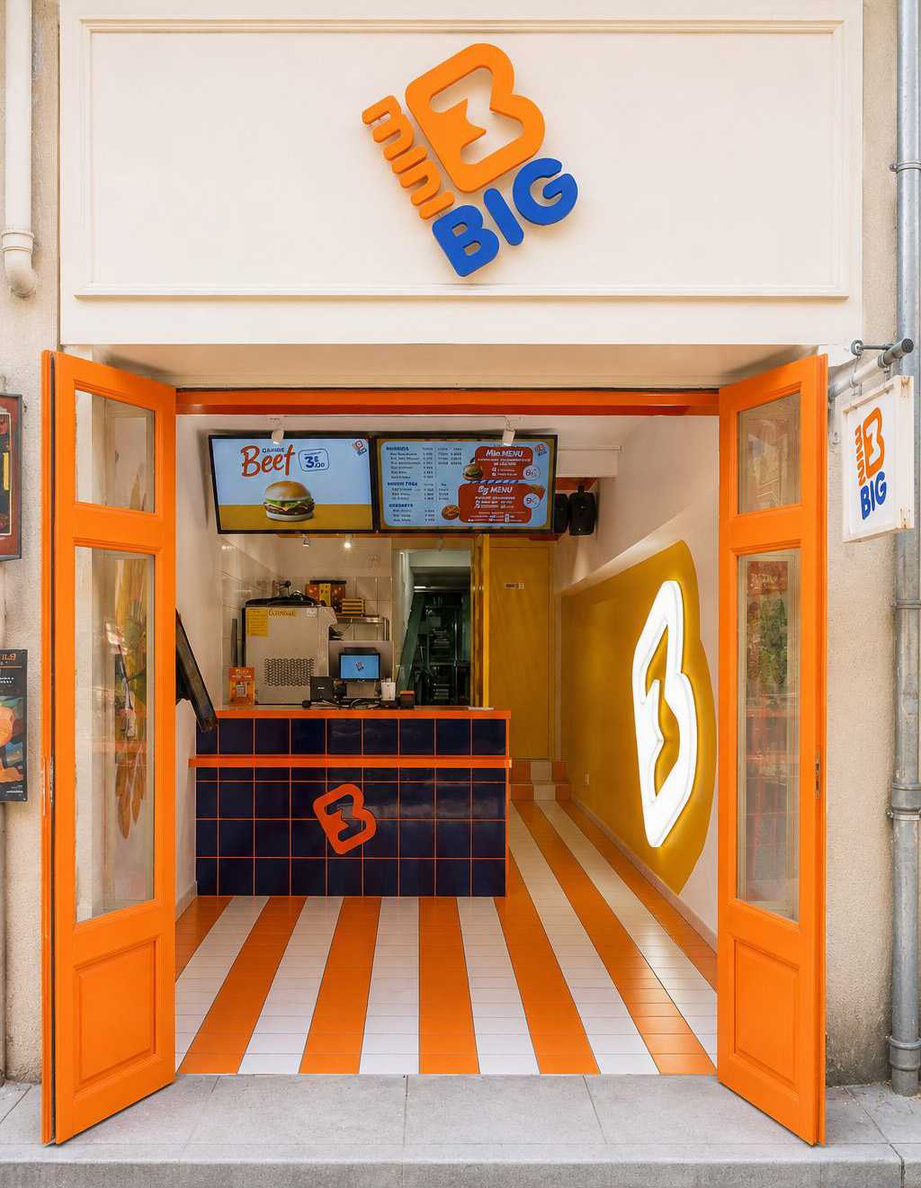
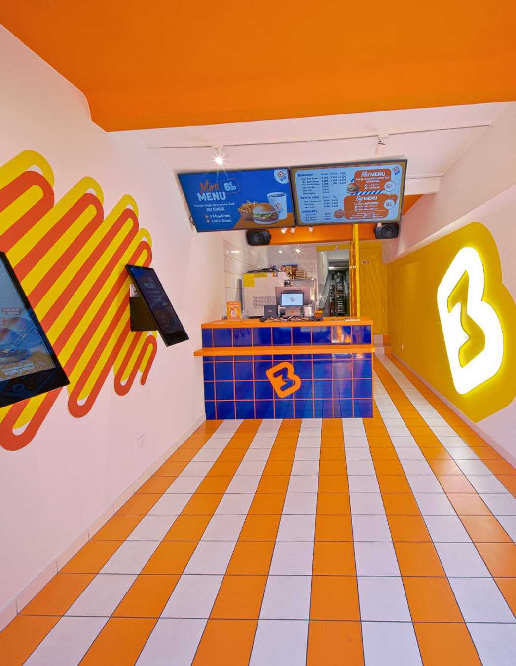
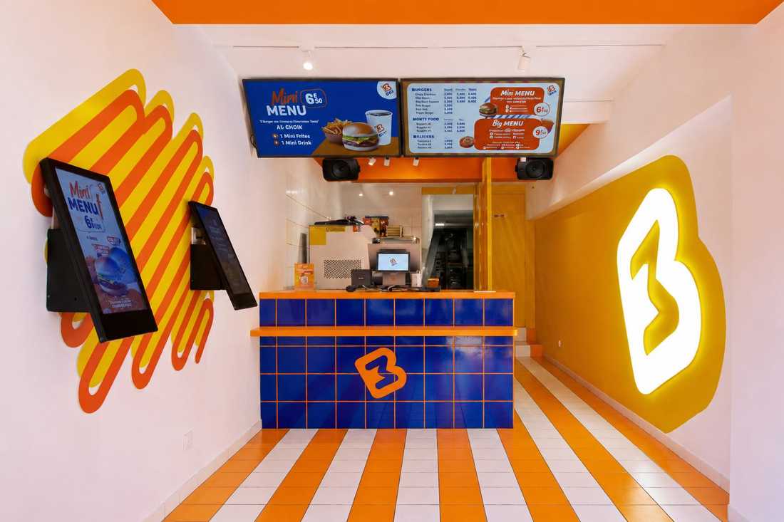
Le parti pris de ce projet d'architecture commerciale est immédiatement visible : orange vif, bleu électrique et violet profond, posés en aplats et en carrelage.
Un sol à damier orange et blanc file vers le fond du point de vente et étire l'espace.
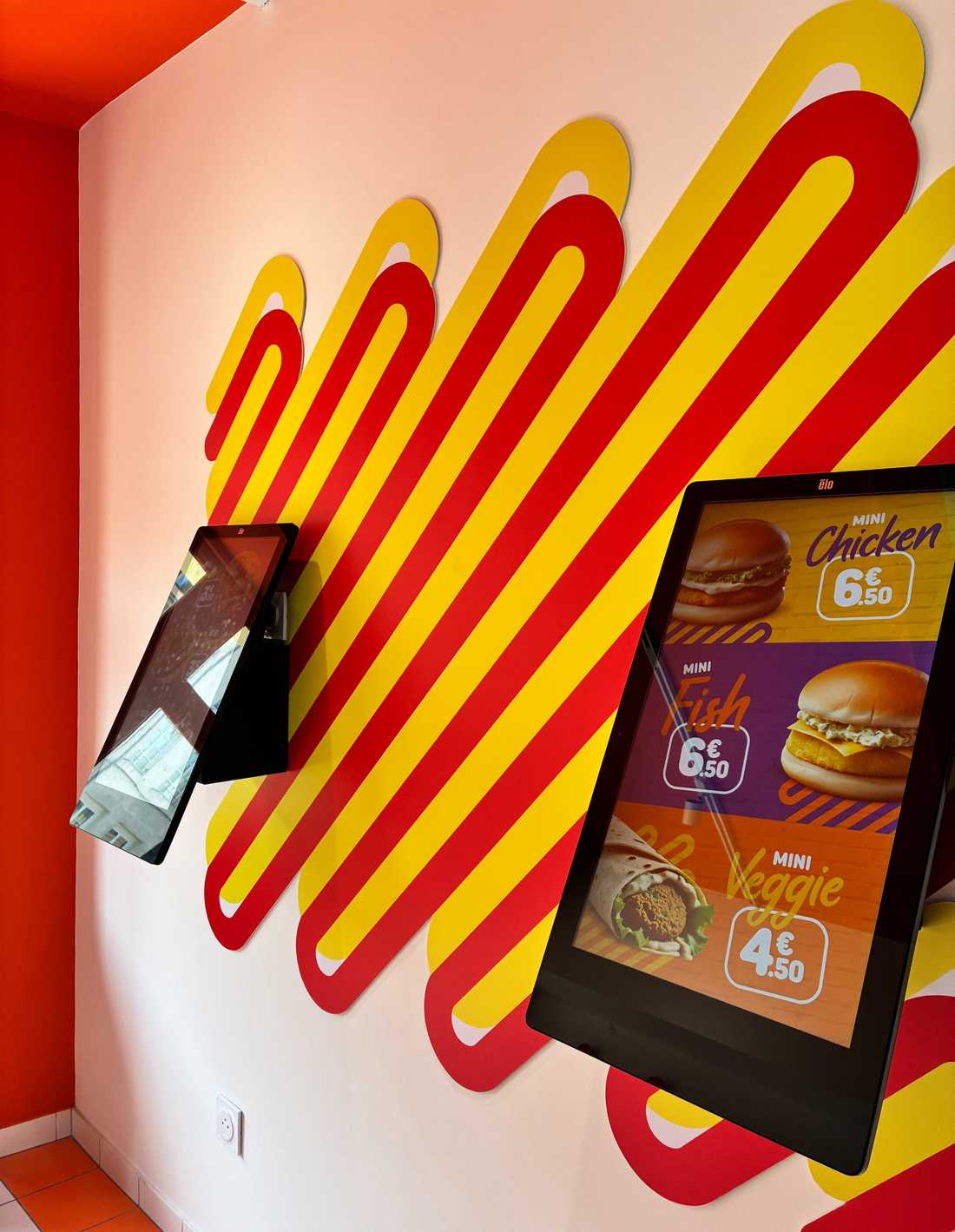
Un claustra graphique habille le mur d'entrée et signe le projet. Conçu pour être un marqueur visuel reproductible d'un point de vente à l'autre, ce claustra capte le regard et filtre la lumière.
Des pièces sur mesure
Plusieurs pièces fortes ont été dessinées sur mesure :
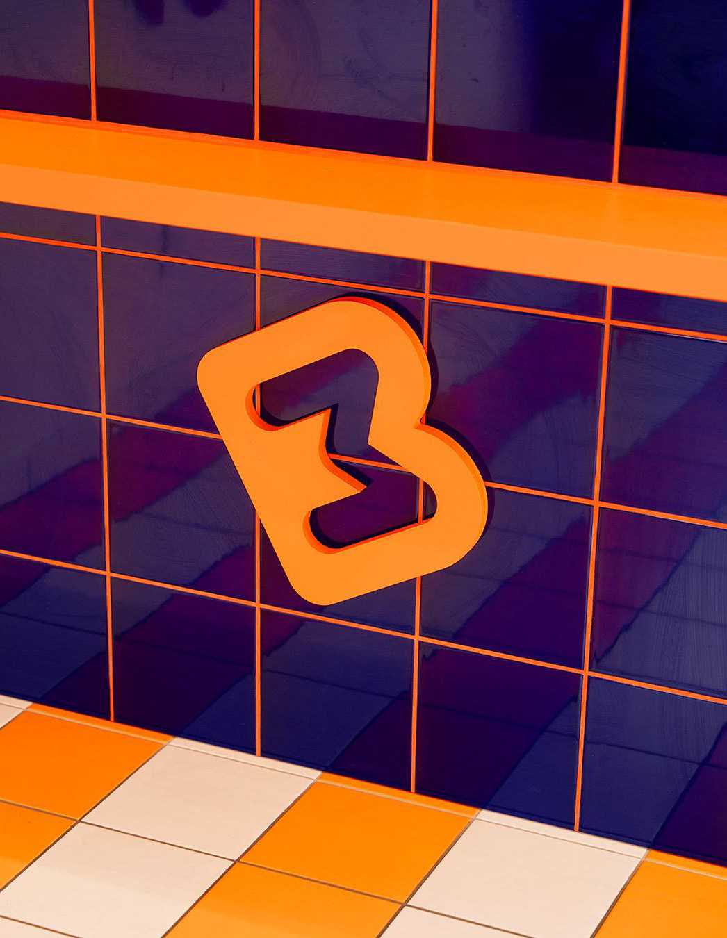
- le comptoir habillé de carreaux bleus jointoyés d'orange,
- le logo lumineux mis en scène comme point d'ancrage,
- la signalétique et l'affichage digital des menus, intégrés au décor.
Chaque élément sert l’écriture de marque et se lit d'un coup d'œil depuis l’extérieur du restaurant.
Une coordination technique au service de l'exploitation
Notre intervention recouvrait également l'ensemble des lots techniques, de l'électricité à la ventilation en passant par les fluides et l'éclairage, dans le respect des normes propres aux ERP et aux restaurants.
Une circulation fluide, un espace de commande clairement défini, des matériaux résistants et faciles d'entretien : tout l’aménagement est calibré pour un usage intensif.
Conçu comme un concept déclinable, ce local commercial transforme la contrainte d'espace en atout d'image et pose les bases d'un modèle déployable en réseau.
The founders of the Mini Big brand asked us to design their first store, conceived from the outset to be rolled out as a franchise. The project involved creating a retail space with a strong graphic identity.
The stance taken in this commercial architecture project is immediately visible: vivid orange, electric blue and deep purple, applied in flat panels and tiling. A chequerboard floor in orange and white runs toward the back of the store and stretches the space. A graphic claustra screen dresses the entrance wall and signs the project. Designed to be a reproducible visual marker from one store to the next, this claustra catches the eye and filters the light.
Several strong pieces were custom designed: the counter clad in blue tiles grouted in orange, the illuminated logo staged as a focal point, and the signage and digital menu displays, built into the decor. Every element serves the brand's visual language and reads at a glance from outside the restaurant.
Our work also covered all the technical trades, from electricity to ventilation, plumbing and lighting, in compliance with the standards specific to public establishments and restaurants. Smooth circulation, a clearly defined ordering area, and durable, easy-to-maintain materials: the whole layout is calibrated for intensive use.
Designed as a replicable concept, this commercial unit turns the constraint of limited space into a brand asset and lays the groundwork for a model that can be rolled out across a network.


