Optimizing an apartment from the 70s
- Dimensions: 73 m² - 3 rooms (including 2 bedrooms)
- Style: Contemporary
- Objectives: optimize space, decompartmentalization
- Study: 2 months
- Construction: 4 months
Cet appartement des années 70 manquait de place et de modernité. L’architecte d’intérieur l’a transformé en un espace de vie chaleureux et confortable pour Laurent et son fils. Une rénovation originale et sur-mesure répondant à un fort désir d’optimiser l’espace et de faciliter la vie quotidienne.
Les souhaits du propriétaire : fluidité, lumière et minimalisme
Laurent, propriétaire de cet appartement situé dans le charmant quartier près d'un parc urbain, souhaitait vivre avec son fils dans ce 73 m² n’ayant connu aucune rénovation depuis plus de 40 ans. Comme beaucoup d’appartements construits dans les années 70, celui-ci contenait trop de portes et un cloisonnage excessif. La rénovation a nécessité 2 mois d’étude et 4 mois de travaux.
Les souhaits initiaux de Laurent étaient multiples :
- Gagner en place, optimiser l’espace et améliorer la fluidité de la circulation dans l’appartement
- Faire entrer la lumière, atout de cet appartement, aux moments propices de la journée en s’adaptant au rythme de vie de Laurent et de son fils
- Adopter un style très contemporain, ordonné et minimaliste en « cachant » au maximum les espaces de rangement.
La réponse de l’architecte : décloisonner et adopter un mobilier intelligent
L’architecte d’intérieur a eu carte-blanche pour donner à cet appartement un caractère atypique, contemporain et chaleureux.
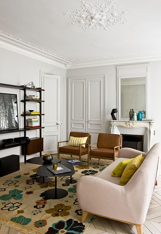
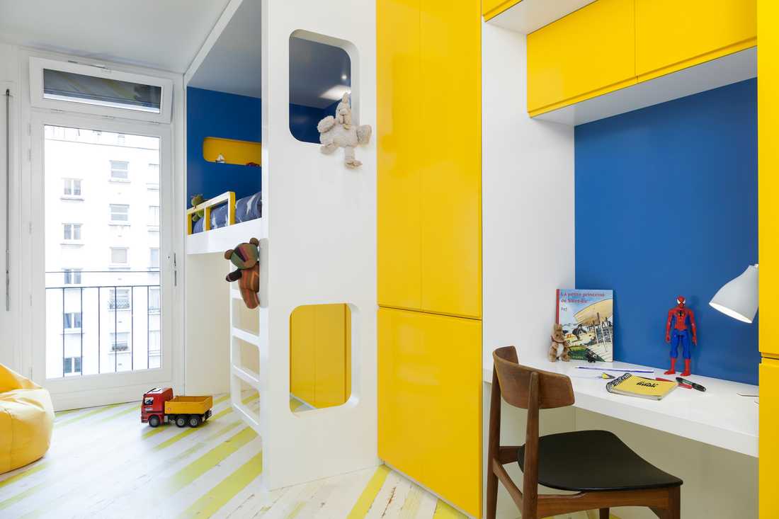
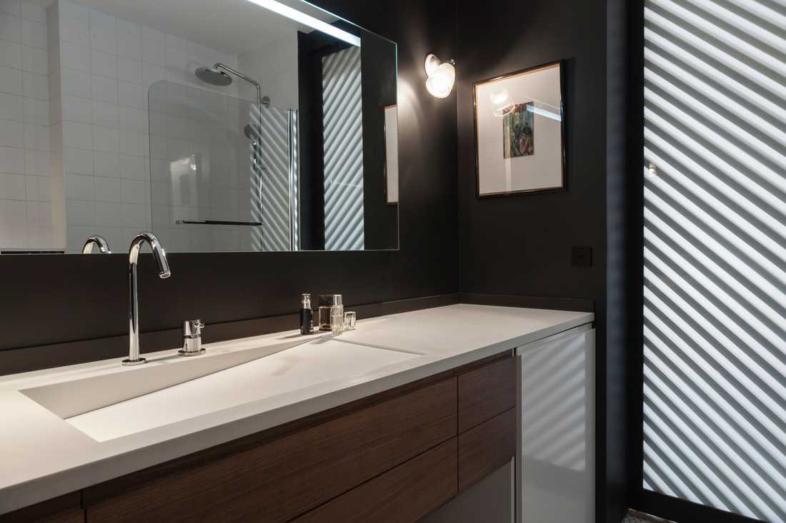
La première étape a consisté à décloisonner au maximum en supprimant murs et portes inutiles, dans le but d’optimiser l’espace. La chambre d’enfant est passée de 10 à 13 m², le couloir a été supprimé et les WC ont été renvoyés dans la salle de bain, qui a aussi gagné une baignoire. Le mur séparant les chambres des pièces à vivre a été repensé entièrement en tant que cloison modulable, une façon originale et contemporaine d’organiser l’espace.
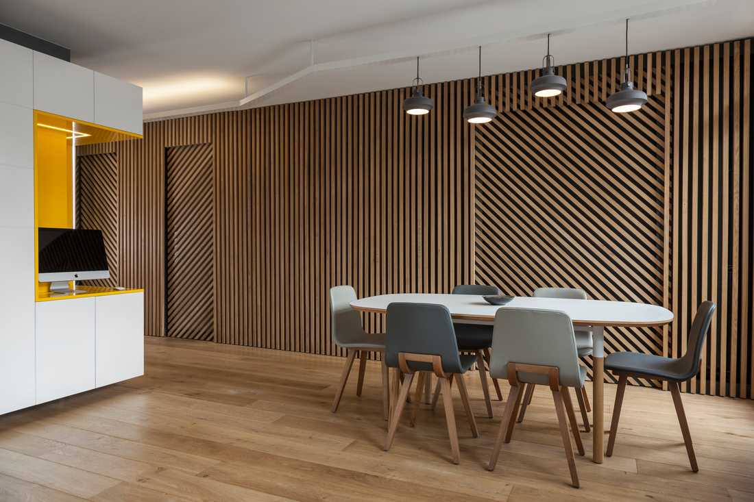
La cloison, colonne vertébrale de l’appartement
Ce « mur animé », vivant et graphique, est véritablement devenu la pièce maîtresse de l’appartement. Il est composé de tasseaux de chêne alignés à la verticale le long de la cloison centrale superposés à une fixation Valchromat noire. Une porte dite « à galandage » (deux panneaux superposés fixés sur un rail) lui donne une identité graphique et arty inspirée de l’art cinétique. Cette nouvelle façon de séparer la pièce à vivre des espaces nuit donne toute son identité à l’appartement. Elle remplit également un rôle fonctionnel en permettant de faire entrer la lumière ou de rendre la chambre adulte opaque, selon le moment de la journée, ou son envie.
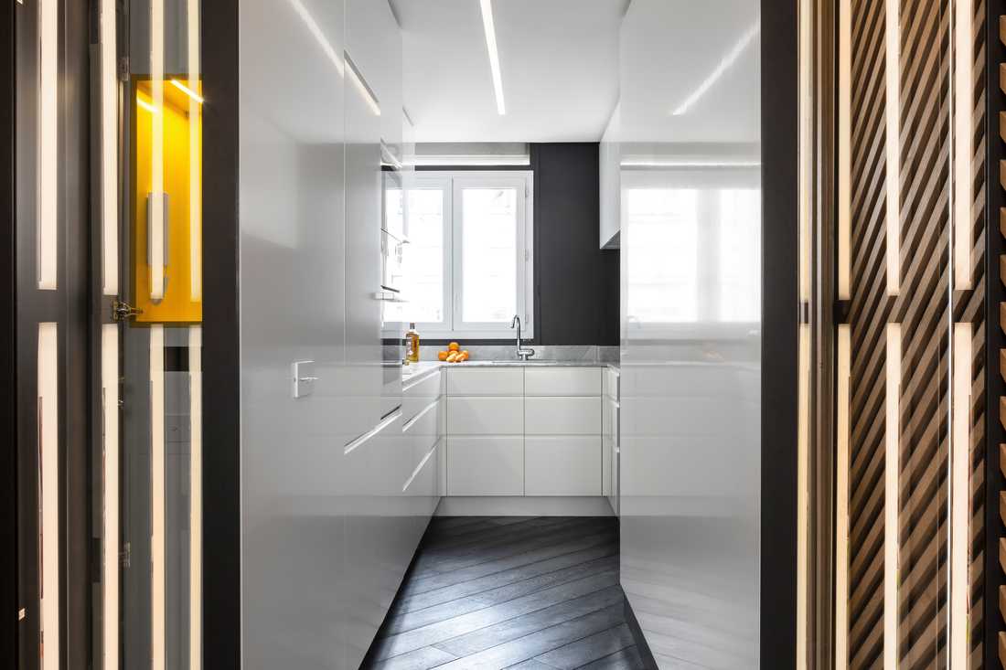
En répondant au désir de minimalisme et d’ordre naturel de Laurent, l’architecte a fait le choix d’adopter un mobilier intelligent pour rendre le rangement discret voire invisible. Un grand meuble multifonction part de l’entrée pour arriver au salon, en tournant en angle droit. Dans la ligne directrice d’optimisation de l’espace, il intègre par exemple un vide-poche façon boîte aux lettres, une penderie, un bureau et une bibliothèque. Afin d’éviter de donner un aspect « massif » à l’ensemble et de conserver la fluidité désirée, celui-ci a été décollé du sol et du plafond. Dans le même esprit, la chambre enfant a été équipée d’un lit-cabane composé de divers rangements. La cuisine, également refaite, a été équipée de portes sans poignées afin de gagner en sensation d’espace.
Côté couleurs et décoration, l’architecte a opté pour un jaune dynamisant en touches dans la pièce à vivre. Ce jaune est rendu plus audacieux dans la chambre enfant. La chambre adulte, elle, conserve des teintes neutres. Un long luminaire fabriqué sur mesure éclaire la pièce de manière indirecte, les sources étant tournées vers le plafond.
Dans la cuisine, la peinture murale, d’un gris noir satiné, rappelle la tonalité du parquet de chêne noir.
Dans la salle de bain, une simple vasque rappelle l’identité simple et épurée du reste de l'appartement.
Pour en savoir plus sur cette rénovation :
> Extrait du magazine "Du Côté de chez vous"
This 1970s apartment lacked space and modernity. The interior designer transformed it into a warm and comfortable living space for Laurent and his son. An original and tailor-made renovation that met a strong desire to optimize space and make daily life easier.
The owner's wishes: fluidity, light, and minimalism
Laurent, the owner of this apartment located in the charming neighborhood near an urban park, wanted to live with his son in this 73 m² space that had not undergone any renovation for more than 40 years. Like many apartments built in the 1970s, it contained too many doors and excessive partitioning. The renovation required 2 months of study and 4 months of work.
Laurent's initial wishes were multiple:
- Gain space, optimize the layout, and improve the fluidity of circulation in the apartment
- Bring in natural light, one of the apartment's assets, at the right moments of the day while adapting to Laurent and his son's lifestyle
- Adopt a very contemporary, tidy, and minimalist style by "hiding" storage spaces as much as possible
The architect's response: open up and adopt smart furniture
The interior designer was given carte blanche to give this apartment an atypical, contemporary, and warm character.
The first step was to remove partitions as much as possible by eliminating unnecessary walls and doors, in order to optimize the space. The child's bedroom grew from 10 to 13 m², the corridor was removed, and the toilet was integrated into the bathroom, which also gained a bathtub. The wall separating the bedrooms from the living areas was completely reimagined as a modular partition, an original and contemporary way of organizing the space.
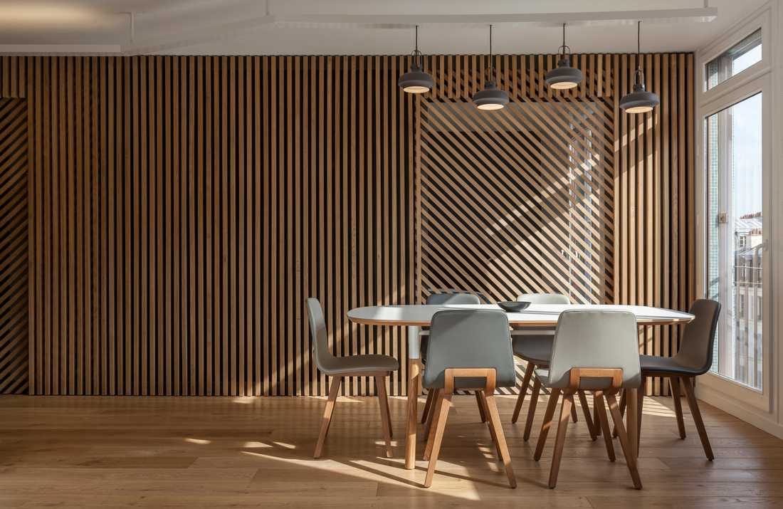
The partition, the backbone of the apartment
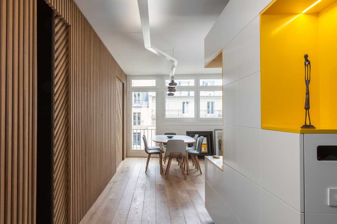
This "animated wall", both lively and graphic, truly became the centerpiece of the apartment. It consists of vertically aligned oak slats along the central partition, superimposed on a black Valchromat support. A so-called "sliding pocket door" (two overlapping panels fixed on a rail) gives it a graphic and arty identity inspired by kinetic art. This new way of separating the living room from the sleeping areas defines the apartment's entire identity. It also fulfills a functional role by allowing natural light to enter or making the master bedroom opaque, depending on the time of day or the desired atmosphere.
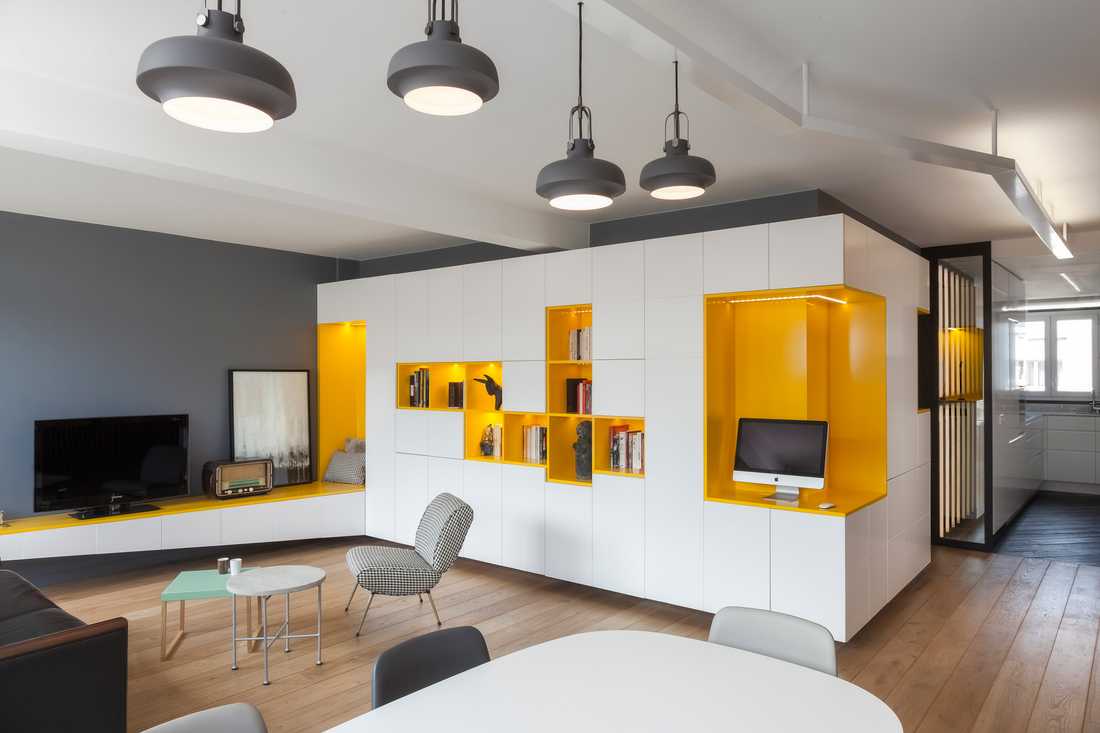
In response to Laurent's desire for minimalism and natural order, the architect chose smart furniture to make storage discreet, even invisible. A large multifunctional unit runs from the entrance to the living room, turning at a right angle. In line with the space optimization strategy, it integrates, for example, a mailbox-style tray, a wardrobe, a desk, and a library. To avoid giving the unit a "massive" appearance and to preserve the desired fluidity, it was raised off the floor and ceiling. In the same spirit, the child's bedroom was fitted with a cabin bed that includes various storage solutions. The kitchen, also redone, was fitted with handleless doors to enhance the sense of space.
As for colors and decoration, the architect opted for energizing yellow accents in the living room. This yellow is made bolder in the child's bedroom. The master bedroom, meanwhile, retains neutral tones. A long custom-made light fixture illuminates the room indirectly, with light sources directed toward the ceiling.
In the kitchen, the satin dark gray wall paint recalls the tones of the black oak flooring.
In the bathroom, a simple basin echoes the simple and uncluttered identity of the rest of the apartment.
Learn more about this renovation: